Friday, June 20, 2014

Wishing You Much Happiness card ~ Creative Embellishments ~


Happy Monday, Creative Embellishments fans! Sandi here with you today sharing a quick and easy card for any occasion.  I've use some yummy 7 Dots Studio's Nature Walk papers along with 3 pieces of Creative Embellishments chipboard all of which were quickly and easily altered. 

I've been itching to use the Doily Frame from Day 1 with the CE Design Team.  Now that I have once, I'm ready to stock up on these because the possibilities are endless.  I have tons of ideas rolling around in my head! It was primed with white gesso and allowed to dry. Then I merely spot colored it with my Prima chalk ink in Dark Roast.  I've done the same with a bit of Frond Set 1 that is tucked into the floral cluster on the left. I've used a Verve stamp for my sentiment and cut the round shape with my circle maker. 


Lastly, I added the Wavy Music Note Border on top of the bottom floral cluster and swooping across the card. It was stamped randomly with black Staz-on ink. I thought about embossing it but really wanted to go with a more flat, non-shiny look. I really had planned a monochromatic theme but couldn't resist adding my hot pink flowers! 

Thanks for coming by today! 


Monday, June 16, 2014

Gorgeous ~ Creative Embellishments


Happy Monday, everyone! Yes, I know! It's back to work for some of us but hopefully we are feeling recharged! 

Today I wanted to share a layout that was inspired by some new photos and paper along with my obsession over the Flourish Circle Frame. I swear I could use it on everything!! I've used some of my 7 Dots Studio Nature Walk paper .. heaven! To achieve my background I've used a Prima stencil, molding paste, some Prima and Lindy's Stamp Gang mists and my fun Creative Embellishments Crackle Stamp .. love that thing!! I have a canvas coming up in a few weeks and that stamp was the perfect finishing touch! 


To treat my Flourish Circle Frame I gessoed and then spot inked it with pink and charcoal chalk inks, Then I gave it a light coating of Glossy Accents and sprinkled some purple micro-beads here and there.
Then I added a new Butterfly Flair from the CE store. Isn't it the perfect accent? 


Here is a close-up of the Gorgeous title which was primed with gesso and then dabbed first with a charcoal chalk ink and then splotched with black. I wanted to give it an aged look. 

You can also see the Distressed Crackle Stamp in action here. I like to use it without a glass block and just roll the ink onto the project. 


Another shot of the Distressed Crackle Stamp along the top of the page. 

Thanks for coming by today! I hope that I've given you a few ideas how to use your Creative Embellishments products to their best advantage! Don't forget you still have plenty of time to play along with our fun June Challenge! 


Saturday, June 14, 2014

June Tutorial for My Creative Scrapbook

Hello, everybody! Sandi here with you today sharing a quick organizational project that I did shortly before our June Kit Reveal. 

My stencils and masks were in a bit of a mess! They were mostly in drawers but some were hanging on hooks and everything was bursting at the seams. With more stencils coming in the mail, I decided that I had to stop and take time to organize them better. 


So, I pulled out an old post bound scrapbook album that was given to me. Since I use strap hinge and D-ring (and plastic bins), this was  just sitting around not being utilized. I thought it might make a nice home for my 12x12 stencils! 


So, I pulled my stencils out of their packing and trimmed the packing down to 12x12. Then I slid the packaging into the page protector and placed the stencil in front of that. I considered using all matching card stock as a backing but thought I'd function better using the manufacturer packing since I was accustomed to seeing it that way. 


On the back of the packaging I wrote the name of the stencil ... if I still remembered it or it was labelled already. 


I kept moving along trimming and placing everything so that all the like manufacturers were grouped together. Since Prima often labels by product number, that part of the packing was important to me.  You can see that the stencils do stick out a bit at the top since they are longer in height than 12 inches.


Some stencils were more difficult to insert and I found that standing the album upward helped me get all the detail within the page protector with less effort. 


I'm sharing this close-up to show you why you need to wash your stencils right away after using molding paste or gesso.  Yes, it stays on the stencil and they look yucky as well as not being as functional.  This was a favorite, too! 


After doing 27 of these, I was done  with all my 12x12 stencils and masks.  Of course, I left some extra page protectors empty for my ever-growing collection! Now, only time will tell how well this system works! But at least it looks a bit more tidy for right now. 


Now … I have to figure out what to do with my 6x6s. For now, they went back in the drawer! 

Thanks for coming by today! 


Monday, June 9, 2014

My Creative Scrapbook June Reveal, part #2


Hi there, everyone! I hope that you had a great weekend! Summer is now well underway! Not that that means anything different around here .. except that it's hot!! 

I'm here to share my last 2 pages using the June Limited Edition Kit from 
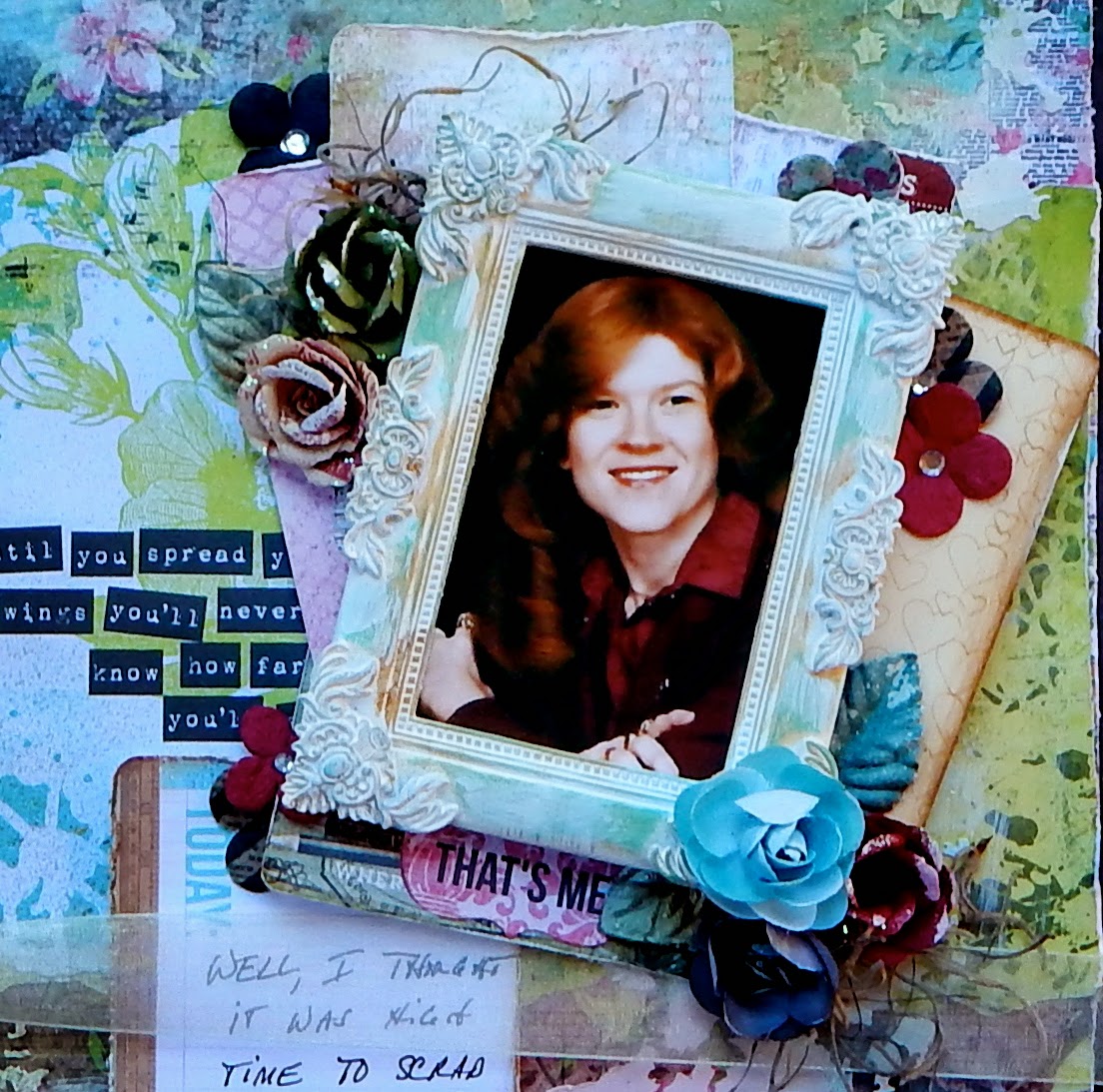
My Creative Scrapbook. This time I've gone with the brighter papers from the Kit. That bright green in the middle is actually one of my favorite's from the collection! I had planned to use it as my primary background but opted to just use it as a focal point.  I fussy cut the doily from one of the patterned pages and placed it to the left of my photo and embellishment cluster. Yes, that's me back when I was still skinny and had lots of auburn hair. I really loved my red hair and was sad to see it start turning browner as I got older. I used to wear a ring on every finger too right about then .. heehee! 

I've stenciled and white-washed my background although that floral paper is to die for! I was just trying to do something a little different from what I'd seen. I also experimented with my new Prima Color Bloom spray in Lime Wedge and Antique Gold. 


I loved the white Shabby Chic resin frame from the Kit!  I've added some Rub and Buff in Patina along with some Prima chalk ink in Dark Roast, then softened it with gesso. I used another Webster's Pages wood veneer frame as a layer as well as some Prima flower packaging! The wood veneers are so pretty.   I loved using the Stationer's Compose collection as little fillers here and there. I wasn't sure about them at first but they were perfect for adding to your layers. 


Just showing you some stenciling, misting and that fab frame! 


I'm not certain what possessed me to wrap this all up in a bow .. but I did!! LOL

***


This was my last page and it features a great photo of my mom. I have to stop scrapping her because I'm running out of album for her! =) I challenged myself to use the hot pink paper in the Kit although it's brighter than I normally work with. In the end, I distressed it heavily, gessoed it and probably changed it's character but sometimes, we are just left with a hot mess! So, I'm calling it like I see it! There's a little bit of everything on this one .. punch work, distressing, mixed media and pretty flowers. I chose the dark pinks, blacks and grays to highlight this one along with some teal. I saved the yummy bling for this page .. I thought Momma would like that! The strip journaling is soooo appropriate for her. She was a happy, stay-at-home mom married to the man of her dreams. 


Just a close-up. See, I even scratched those pretty hot pink papers with my scissors. Like I said, a hot mess. But hey, this is vintage! 


A sweet banner for the top left. 


And the journaling that inspired me to scrap my mom once again! Isn't it great that she felt that way?! 

I hope that you've gotten your Kit ordered or that you're stalking the postman! If you want to sign up and never miss another great Limited Edition Kit, go HERE for all the details. Also, if you haven't been by the Design Team gallery, then click HERE. You'll see everyone's creations with whichever Kit they received. Limited Edition is usually down towards the bottom. 

Thanks for coming by today! Hope you have a great week! 


Thursday, June 5, 2014

My Creative Scrapbook June Kit Reveal, part #1

It's finally Reveal Day over at My Creative Scrapbook! I had the pleasure of working with the gorgeous Limited Edition Kit featuring KaiserCraft's Kaleidoscope collection along with Prima's Stationer's Blooms and so much more. This one is bright, happy and fun but still so feminine and pretty. 


I couldn't wait to use these papers that I knew would be perfect for a photo of my daughter and her hubby at their beach wedding last year. I did lots of distressing with tearing, punching, inking, stenciling, misting .. and here is my result. I loved creating my clusters layering in some notecards, doilies, lace and wood veneer. 


Just a close-up of the floral cluster and some of the distressing. Also, lots of random gesso splatters which really brought the whole page together. 


More florals and stenciling. The paper doilies and moss are from my stash. 


One of my favorite pages in a while! 

***


Next up is from a family photo shoot. I have about 150 new photos to scrap, yay! Photo credit to Magnolia Adams. Wanting to mimic the canopy shown in the photo, I did some paper pleating to create those same lines and added a ribbon at the top. Before adding in my layers, florals and photo,  I did some stenciling and misting on the background paper. It was just so perfect for my photo! I've used a Prima damask mask, molding paste and Lindy's Stamp Gang Cotton Candy and Heidi Swapp's Color Shine Teal. Then just parts and pieces from the kit along with a Prima stitch stamp from my stash! Had some fun with my dual title, part Thickers and part KaiserCraft labels.  Gesso brings it all together. And aren't they an adorable little family? 


Here's my sweet little canopy! It's always fun to do something a little different than your norm. 


Florals and stenciling.  My photo is stacked on multiple layers of corrugated cardboard. 


A few more details. 

Here's a photo of the Kit although the ribbon, trim and lace are not pictured:


That's all for today! I'll be back in a few days with 2 more pages for you. 

Meanwhile, if you haven't signed up to get a Kit,  HERE is where you need to go. Also, I hope you'll drop by the Design Team Gallery to see what everyone did with each of the 4 Kits. My Creative Scrapbook has a Main Kit, a Creative Kit, an album Kit and the Limited Edition Kit. Something for everyone! 

Thanks for coming by! 

Sunday, June 1, 2014

Creative Embellishments June Challenge!


This month's inspiration photo and "nautical" theme over at Creative Embellishments went hand in hand to my way of thinking! And when I think "nautical," my Dad's Navy days are the first thing that come to mind. I had an as yet un-scrapped photo of him and some friends that worked perfectly. That's him on the far right.

I pulled out some old, old Prima Printery from my stash to use as my background, doing some stenciling as well as stamping and sewing! Being a big Daddy's girl, I wanted to make this kind of special and thus, willing to sew.  My maiden name was Key, so the keys printed on the paper were an added bonus.


My original plan was to let all my CE products remain naked but I chickened out and used just a touch of chalk ink on the edges of my wood veneer anchorboat wheel,  compass and nautical star. Then they are tucked here and there.  It helps make them a bit more vintage! I built my cluster around a likewise old-ish Prima vine and added florals, mesh ribbon and gauze. 


The wave panel was a fun addition to my layers and was coated with Ranger's Vintage Photo after cutting it up to suit my needs. My new CE Flairs (and new found love) arrived just in time for me to sneak one on my page .. the Discover Nautical Set.  The CE Flairs have so much detail! You are sure to love them. 


Just a little close-up with the Wave Panel peeking out at the top right.


And another close-up of the florals. It was fun to use up some stash and I was thrilled the neutral colors really worked with the nautical theme. 

I'm so grateful for this month's challenge because this is seriously my fave layout of 2014!  I hope that you will hop on over to Creative Embellishments and see what the rest of the Design Team created for the June Challenge! 

Thanks for coming by! I always appreciate your visits!