Friday, March 24, 2023

Bee Kind ~ Altered Tag for Creative Embellishments!

Happy Friday, scrappy fans!

 Sandi Clarkson  here with you today sharing my latest project for Creative Embellishments. It's been a few months since I created anything on one of the Large Tags from the CE store. They are one of my favorite substrates as they are 5.5 inches by 10 inches which provides plenty of room for creating!


Before we get into all the process details, here is a list of the CE products used for your reference:

Creative Embellishments products used:

Large Tags 

Chicken Wire Panel 

Birdhouses 

Flourish Dragonflies. 


I began by selecting my papers from 49 and Market's Countryside collection. Since Spring arrived here in Texas, I was really drawn to the green, yellow and black color combination. I sanded some of the edges here and there for a weathered look. 


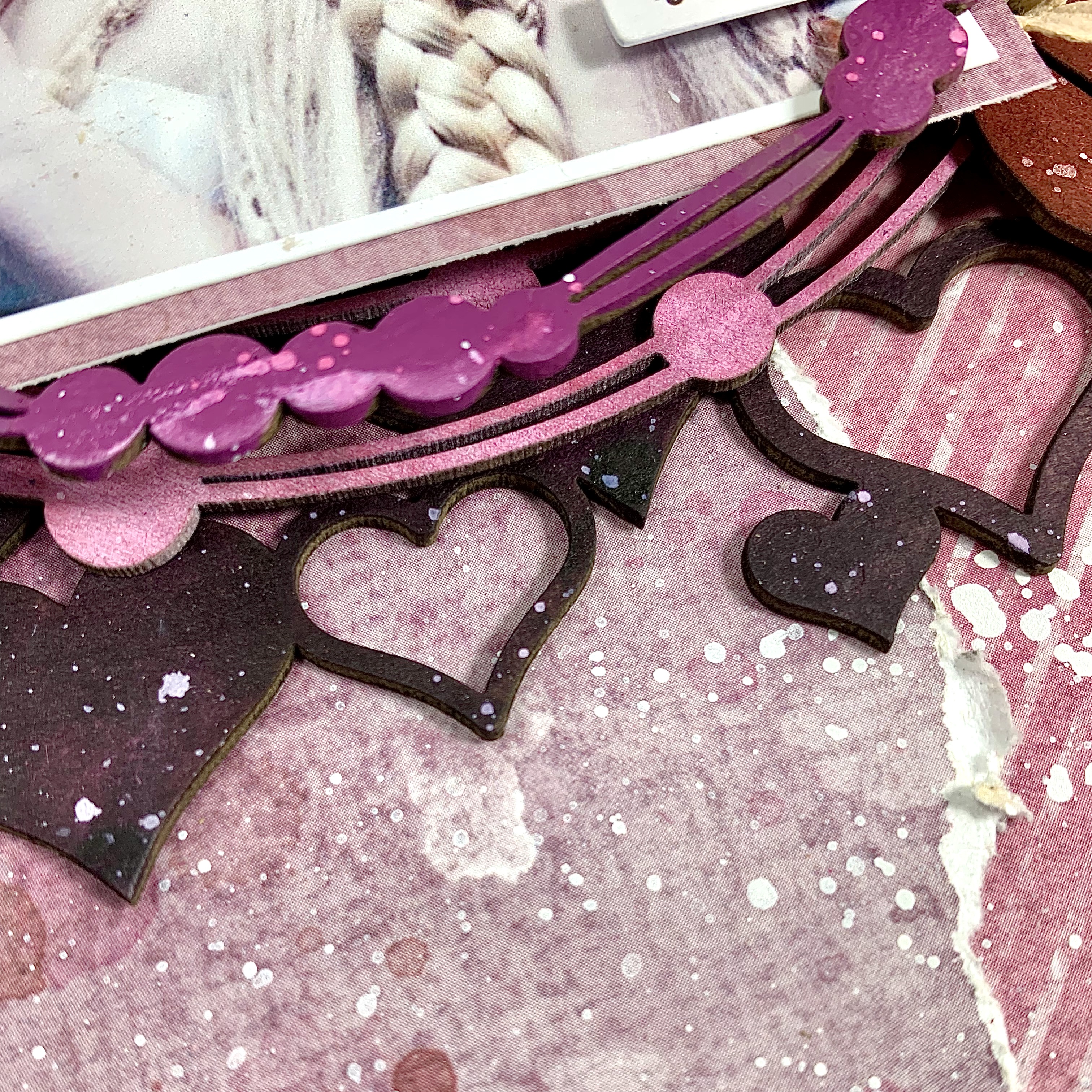
I used a great photo to compliment the papers and got busy selecting  the additional chipboard pieces. I first thought of using everything in its raw, unaltered state but then opted for a light wash of walnut stain over everything except the tag itself.


I've really gotten back in to using the 6x6 panels and went with the Chicken Wire Panel for this piece. I cut it apart and used it to enhance the other elements and to serve as a base layer.

I used a ton of yellow Prima flowers to support everything including this sweet tag with the bee! 


I also tucked in some Olive green florals from 49 and Market as well as some cheesecloth. 


For whimsy, I added the sweet Flourish Dragonfly from the set of 3. Then I layered a subtitle piece over it. So cute! 


Additionally, I made use of the little pieces inside the hexagon chicken wire and added then randomly.


There are so many sweet pieces that go along with this collection, so I've added a second bee to layer over a die cut floral.


Lastly, I splattered Prima's Color Bloom in Gold Foil to blend everything and make my project glisten a little. For once, I opted not to use any further art stones or texture other than cheesecloth which was tucked here and there as well as some crinkle ribbon. 


That's it for me today!

I hope you like this one as much as I do.

See you next time,

Sandi


Friday, March 17, 2023

Together Forever layout for Creative Embellishments

Hello, CE fans!

Sandi Clarkson here with you today sharing a lovely shabby chic layout using a few chippies and some pretty patterned paper from Prima Marketing.


I've had this photo printed out for quite some time waiting for just the right time, right papers etc. Do you pile up photos waiting for the perfect whatever? I sure do.

Anyway, these Love Notes papers from Prima Marketing called for something really special. I adore this photo of some of my grands during a family photo shoot several years ago. This was right before they left for the mission field in Ecuador. That cute baby girl just turned 7 years ago! How can that be?


I thought that with the light colored papers and subdued flowers that some dark chipboard would help ground the project. So, I altered my chipboard pieces with Walnut Stain. However, the wood veneer Heart Clusters were left bare. I love the beauty of the wood veneer all by itself.


Along both sides of my photo. I placed my altered Heart Pieces. On the left I've used the outlined ones and on the right, I used the solid. Much of them got covered up by flowers et cetera but my philosophy is that chipboard (or any embellishment, really) is made for using! The layering of them is what provides texture and interest. It's similar to NOT being afraid to cut into your favorite patterned paper. Use it, folks! Use it!


Here we have one of the wood veneer Heart Clusters I mentioned in the beginning. I also used some little heart pieces from that package near my title and also on the right of my photo.


Here is that cluster on the right. So fun, so layered! I've added in some pearls and other die cut ephemera as well as a die cut doily.


My title piece is from the  Together Forever set which include 2 sets of different sizes. The little teeny tiny wood veneer heart looks so cute added in there!


And this last photo just shows some of my layering of papers, floral, chipboard and other elements.

Once I had the basic design figured out, this layout went together really quickly. Figuring out the layering of multiple patterns can take some concentration and often some fussy cutting, huh?

That's it from me today.

Thanks so much for stopping by!

There are all kinds of Love and Heart-themed chippies in the Creative Embellishments Store. I encourage you to stop by if you are in the market for scrappy supplies!

See you  next time!

Sandi  


Friday, March 3, 2023

Bold and Beautiful for Creative Embellishments

Hello, Creative Embellishments fans!
Sandi Clarkson here with you today sharing another pretty layout that can hopefully inspire you to create something of your own.

This time I tried doing another monochromatic look and choose mainly Plum/Wine/Purple tones. I also mimicked last week's method of choosing a panel chipboard piece, a frame (or two) and then chipboard accents to tuck in here and there.


My photo is from Tumblr or Unsplash and works perfectly with my primary chipboard frame. The silver tones work well with the darker hues surrounding it.


 For my base layer I chose the Heart Panel 2 which was altered with 13 Arts Violet Ink which is a very dark saturated color.  I opted to use 2 frames this time and the one beneath my photo is the Out of this World Frame. You can barely see it here but I mention that because it was the order of my process. I altered that frame with Distress Oxide Spray in Picked Raspberry.

After readying my photo with a photo mat and mounting squares, I painted the Feather and Beads Frame  using Distress Paint in Seedless Preserves. I also had fun altering the look by applying droplets of the previous Oxide color and swishing with water to achieve the oxidized look.


I had 5 feather pieces from the Feathers set that I layered into my focal point. Three of them were altered with Distress Spray Stain in Kitsch Flamingo without any prep to the chipboard. They looks more pink IRL but I had fun just experimenting and skipped the gesso prep. The other 2 feathers were altered with 13 Arts Woodbine Chalk mist and you can visualize one of those here. Although not quite in my color palette, they do blend with the beautiful 49 and Market Plum Grove papers that I used.


Here you can see the Out of this World Frame just a bit better, as well as the Heart Panel 2. Since my panel was already irregular, I saw no need to cut it apart.


I love how the Feathers soften the look of the focal area and wanted them to really stand out. Thusly, I omitted adding any fibers such as moss or sisal.  I did have some merlot florals from 49 and Market which I've used here but the larger floral was just the best I could find last night without going to greater lengths. I think it works fine given my floral layering papers with the florals at the top.


To balance my layout, I added a cluster to the lower right hand area of the layout and added a title piece. Lots of foam to pop up the layers.


I added in a bit of ephemera from the Plum Grove collection as well as a few neutral parchment florals also from 49 and Marlet.


Here is a side view to show the page dimension which is actually flatter than my norm. Ha! Additionally, I added my butterflies after taking this photo. Taking photos of your work can very often help you see what is missing from your project that you might overlook in the moment of creating.


I finished with some splattered white paint and a few purple/plum flat backed pearls.
Thanks so kindly for dropping by the blog today! Let me know if you are inspired to use a monochrome theme!
 
See you next time!
Sandi