Friday, August 11, 2023

Follow Your Heart ~ Creative Embellishments

Hello, Creative Embellishments friends!

Sandi  here with you today sharing my newest layout for Creative Embellishments Design Team.


My paper choices were from 49 and Markets Everywhere collection along with a colorful sheet from Simple Stories. I originally had another photo chosen for my project but as I worked another came to mind, this one from an unknown artist. The colors and aura seemed to go well with my paper choices.

Instead of using a frame this time, I chose to finally use the Mechanical Woman Head painted with Distress Paint in Brushed Corduroy. That didn't seem to make much impact, so I added Walnut Stain as well as some Shimmerz Hot Fudge Vibez. After that I sprinkled on some Stampendous Aged Gold Embossing Enamel here and there but mostly on the small gears and heat set that for a little sparkle! I added walnut ink around the edges.


Next I worked on altering my chipboard title and the leaves that I chose to nestle in my florals. The Follow Your Heart Title was altered with Walnut Stain while the Mini Leaves 6 were painted with Prima's Victorian Green Impasto Paint.


Because there was a combination of rust and pink in my focal image, I opted to use those same tones in my floral cluster. Because I didn't want to obscure the profile of the chippy piece, I placed all my floral to the left. And I used a lot, LOL!


In order to add some detail to my florals, I've added Prima pearls as well as glitter from 13 Arts. As you might see here, I've also incorporated some rub-ons from 49 and Market using Plum Grove as well as In the Leaves. Next, I tucked in some tickets from the Everywhere collection.


Although the CE stamps have been retired, I still continue to use them in my work.  You can see a bit of the Circle Bokeh Stamp here.


I did lots of paper tearing as I began my work but made sure to place my Mechanical Woman Head on lighter background. I seem to have a stray glue string laying on my piece.


Just a view toward the bottom of the focal elements.


Lastly, I placed my title piece, small florals and did some splattering with white gesso.

That's my project for today! I hope you are finding time in the busy summer (winter) months to create! It's good for the soul.

See you next time!

Sandi


Creative Embellishments products used: 

Mechanical Woman Head 

Follow Your Heart 

Mini Leaves 6


Monday, July 24, 2023

Awesome Adventure Tag for Creative Embellishments

Good morning, Creative Embellishments fans!

Sandi  here with you today sharing an Oversized Tag, one of my absolute favorite sizes to work with. These Tags are 5.5 by 10 inches so there is plenty of room for creating!


To cover the Tag I've used a couple of papers from 49 and Market's Everywhere collection, tearing and then layering them. The back side of the Tag was left raw although I wish I'd added paper there as well in the event I wish to gift this and add a signature. The sweet photo is of a grandson and his wife.


Next I looked through my stash for some frames to bring the eye to my focal point. While I opted to use the awesome Twig Frame with Fall Leaves to encircle my photo, I was tickled to also use our Sun Frame which is new to me. I've altered it with paint and added it beneath my photo and flowers.


The Sun Frame was altered with Tim Holtz Distress Wild Honey Paint along with some Distress Rusty Hinge Ink brushed along the edges. Love how it turned out! The Twig Frame was altered with Walnut Stain. I set aside the Fall Leaves for another time.


After adhering the Sun Frame to the covered Tag, I added 3 medium to large 49 and Market florals on top to support my photo along with small pieces of cardboard to help in supporting the weight of the photo. After I added my photo, I added the Twig Frame, then set about doing my finishing details. This was a mix of smaller florals, buds, ephemera, art stones and white splattered paint. I went a little wild with my paint this time, despite covering my photo.


Before I began gluing everything down, I used a rub-on from the Everywhere collection that says "I'd go anywhere and everywhere with you." I felt that was perfect for these two adventuresome lovebirds!

Thanks for dropping by the Creative Embellishments blog today!

See you next time!

Sandi


Creative Embellishments products used:

Large Tag 

Sun Frame 

Twig Frame with Fall Leaves


Friday, July 7, 2023

Hiking Layout for Creative Embellishments

Hello, Creative Embellishments fans!

Sandi Clarkson here with you today sharing a new layout for the Design Team blog!


I've been wanting to scrap this photo of my oldest grandson for quite some time. When I got this new 49 and Market Everywhere collection, it all finally came together. Even though it's been a popular foundation for many crafters, I really wanted to use it as is. I used it without any additional mixed media on the background since the paper already has done the work.


I chose 3 pieces of chipboard and altered all of them by painting then with walnut stain. Quick and easy with a grounded nature,  I chose the Globe 6 inch, the Hiking title set and the Travel Corner. Links to all these pieces are at the bottom of this post.


The Globe chipboard serves as the base to my focal area. The actual photo was matted with ephemera from the Everywhere collection and stapled together after distressing the edges somewhat.


Next I moved on to adding my floral even though it's a masculine page. I really like the texture they provide and I mostly used blue. My florals are all 49 and Market.


I did add a few rub-ons which always help give the layout great dimension. I positioned my Hiking title piece in between the 2 focal areas.


As is usually the case with me, my focal area did cover a great deal of the Globe chippy but I'm okay with that. I like using my chipboard as layers versus always having it as the star of the show.


I did try to get a few shots of the Globe for you.


I had fun creating this cluster on the right, again using my chipboard as a base layer. Die cuts, florals and art stones pulled it all together. Even with a bow, I think the cluster is definitely masculine.

After the addition of art stones, I splattered diluted white paint across my layout. If you are new to this technique, be sure that you cover your photo while doing this so that you don't splash on your photo.

That's all from me today! I hope you are inspired to get in your craft area and have some fun!

See you next time!

Sandi


Creative Embellishments products used: 

Globe Set, 6 inch 

Travel Corner 

Hiking


Friday, June 23, 2023

Card and Tag Set for Creative Embellishments

Good morning, Creative Embellishments fans!

Sandi  here with you today sharing a fun Card and Tag Set in a clean and simple style.

It's been forever since I've created a card! You may remember that I have tons of family birthdays in June and July. So, I need to get busy creating some cards, right?


This time I've taken a slim card base in white and turned it horizontally, which is not my norm. I am really liking that format for today's design. I've used some papers and embellishments from the Simple Stories Vintage Life in Bloom collection to pair with my CE chipboard pieces. (A list of the Creative Embellishments product used is included at the end of this post.)


Let's look at the Card first. Here you will find that I've used the gorgeous Heart Lace Border as well as the Film Strip Picture Frame Set to create my card. One of my favorite ways to use my chipboard is by simply stippling it with white paint and a sponge applicator. The trick is to use a light hand and be sure that plenty of the raw chipboard is exposed. It's a fun, shabby chic touch that goes well with most papers. I added a few Simple Stories embellies and it was done. And so cute!


I added a little heart embellishments inside the last heart just for fun!


I was so glad that this image fit nicely inside the piece from the Film Strip Picture Frame Set.


Next I created my fun triple-decker tag!

I haven't created one of these in a very, very long time but I sure love it when I do. I cut my 3x6 pieces and used different punches along the bottom. Next I layer my papers and then use my cropodile to punch a hole at the top. I used the inner star chipboard piece from the Starburst Frame and covered it with a striped patterned paper from the SS Vintage Life collection. First, I laid the star on my paper and used my craft knife to make a template. However, I got pretty lucky because the knife made complete cuts and there was little left to do as far as further trimming. I used a file to distress the edges a bit and added distress ink in peeled paint so that the piece would really pop!


Here you can see the star which I elevated with cardboard. A few embellishments and some crinkle ribbon were added as my finishing touches. Love it!

I think the results are pretty cute. How about you?

Thanks for dropping by the blog today!

We appreciate you.

See you next time,

Sandi


Creative Embellishments products used: 

Film Strip Picture Frame Set

Heart Lace Border

 Starburst Frame (insert)


Friday, June 9, 2023

Adventures Layout with Sandi Clarkson ~ Creative Embellishments

Hello, scrappy friends!

Sandi Clarkson here today sharing a fun layout as my Design Team inspiration.

Now that Summer is nearly here in the Northern hemisphere, I opted to go fun, bright  and flowery!


I had some new Prima Spring Abstract papers and ephemera in my stash and decided it was time to give them a play! I found this fun stock photo on Unsplash and paired it with a notecard from one of the papers.

Of course, my mind was on which chippies to use and I started with the wonderful Infinite Circle Frame. This is one that I really try to always keep on hand because it is so versatile! It can go grungy, CAS, steampunk, feminine or masculine. It's simple but really makes an unassuming statement. I've altered all my chipboard pieces with Navy Blue craft paint from Folkart.

Here are the Creative Embellishments chipboard products used:

Berries 2 

Infinite Circle Frame

Washi Tape Cluster Shape 


After altering the Infinite Circle Frame, I adhered it to the layered page and began placing some of my florals. Next I distressed both my matted photo as well as the small notecard and positioned them on several layers of cardboard.


Along with some chosen ephemera, I tucked in some of the altered Berries 2 to mimic as floral layers. Again another chippy that is multi-purpose.

Additionally, I built up a floral layer beneath the true focal area and also added my title/subtitle pieces.


For texture, I've incorporated pearls, Art Stones and sisal.


Just a peek at the top of the Infinite Circle piece!


I love how the yellow flowers helped make my photo work.


Lastly, I added a balancing area with the help of the Washi Tape Cluster piece and a few of the common elements of the page.


I finished off the page with splattered white paint.


These pastel colors are not my normal genre but I wanted to take on that challenge for this one. And I was happily pleased with the outcome.

Thanks for coming by the CE blog today.

See you next time!

Sandi


Friday, May 26, 2023

Perfect Moment layout for Creative Embellishments

Hello, Creative Embellishments fans! 

Sandi here with you today sharing a quick yet fun layout for my Design Team inspiration.  Quick, because we've had lots of family happenings ... leaving little time for crafting ... That is life's reality sometime. 


I've used 49 and Market's Spectrum Sherbert Butterfly Flight paper as my base and augmented with Simple Stories Vintage Life in Bloom papers and ephemera. This makes for a bright, cheerful composition. 

Because my papers are so bright, I chose to alter my chipboard with white and black paint. The Mini Leaves are painted with Ranger's Picket Fence while the title piece was done with Ranger's Black Soot Spray Stain. I've added the Creative Embellishments product links below: 

Creative Embellishments products used: 

Mini leaves 6. 

 Perfect Moment 


Here's a close-up of the product layering done on the left of the photo. Those are 2 of the granddaughters smiling at the camera. So cute! I find that when layering, it helps to add height with foam tape or corrugated cardboard. That way you can layer in your chipboard and other elements. When strictly using paper, I find it helpful to staple layers together before gluing them down. That way you don't lose that perfect balance you try to achieve with all your pieces. 


As you can see here, I first did some paper tearing and that made it simpler to decide where to place my focal area and then the title. This Perfect Moment chipboard title is one of my favorites. After altering with Black Stain, I embellished it with a few die cut butterflies and flat-backed pearls. 


I love how cute these Minis Leaves are and they are perfect for tucking into your layers. My flair button was a gift with purchase from Shimmerz Paint. After everything was in place, I did some random splattering with the white paint. 

See? Quick and easy sometimes makes the great of pages! 

Thanks for dropping by the blog today! 

See you next time! 

Sandi


Friday, May 19, 2023

Creativity is Contagious ~ Creative Embellishments

Hello, scrappy friends!

 Sandi Clarkson  here with you today sharing my newest Design Team project created for Creative Embellishments.


I've been wanting to create a little something with this Vintage Artistry Countryside paper from 49 and Market. It's actually the B side of "Homestead." But I really do like it! Next I wanted to choose a frame for my main photo and while looking through my stash, I decided to multiply my photos x 3 and also use the smaller Mint Box frames that I like so much!

Creative Embellishments products used: 

Berry Frame 4 

Mint Box Flourish Frame Set 2

Creativity Quote

Small Hexagons Stencil 

After adding a torn paper from Prima's Farm Sweet Farm, I applied clear gesso to my papers. When that dried, I did some stencil work with the Small Hexagons Stencil and modeling paste. While the paste was a drying, I altered my chipboard frames with Rangers Peeled Paint distress paint. Later I added some tonal quality by dabbing with some Peeled Paint in the Ink version. The ink was also used to add color to my stenciled areas using the transfer method. I used it again to darken the berries on the Berry Frame.


After matting my photos, I set about creating a nice repeating design. When I was happy with the design, I adhered everything to corrugated cardboard and adhered my photos. The primary photo in the center was elevated with multiple layers of cardboard.  Additionally, I added some ephemera from the paper collection. Before adding any florals, I tucked in some lime green moss to create a natural, outdoorsy look.


Placing my flowers is always the fun part for me! They add the perfect textural element that most of my projects call for. I thought the 49 and Market Tomato flowers were a nice complimentary color against my greens. I tucked in some small butterflies for a finished look.


My title pieces were altered with Rangers Rustic Wilderness and then placed in the open areas under the photos. Although this separated the actual wording, I liked the placement for this design. The Quote actually reads Creativity is Contagious, Pass it On.


I completed my project with paint splatters, pearls and art stones.


Thank you so much for dropping by the Creative Embellishments blog today!

Click here for a link to the Store: Creative Embellishments

See you next!

Sandi


Friday, May 12, 2023

Heart Motif with Lucy ~ Creative Embellishments

Hello, Creative Embellishments friends!

Sandi Clarkson here with you today sharing another heart-themed project created with the Large Heart Chippy as my base. 


For today's project I've used the Large Heart chippy and altered it with packaging from the 49 and Market Serenity collection, specifically the 72 piece ephemera pack. I used a pencil to draw around the heart chippy, cut it out and then adhered it to the chipboard piece. The packaging is kind of shiny but for my purposes, that was okay. Next I used the Heart Bokeh Stencil and modeling paste to give my piece some texture. Per usual most of it got covered up but hey, that's okay by me. I know it's there and it added to my creative pleasure.


After the modeling paste was good and dry, I transferred some color to the heart using cello packaging. Using my heat gun to dry, I was careful to not overheat the packaging. While all of that was drying, I altered my fave Heart Motif with literally all the blue-green colors in the Distress range. Altering is a little like cooking soup, a bit of this and then a bit of that until satisfied with your outcome, I will say that Salvaged Patina was the hero in this work, along with Black Soot.


I adhered that Heart Motif on the upper left of the heart shape even though it covered some of the modeling paste shaped hearts. It's just a much-loved Valentine favorite of mine and I just had to use it.


I had printed off a vintage photo of Lucille Ball because  .. everybody loves Lucy, right? So I built up the photo layers with corrugated cardboard, ephemera and cheesecloth. Then I mounted that to the heart. Before adding all the florals, I worked on the last chipboard piece, the Love Lock and Key Border Set. This set was altered the same as the Heart Motif except that I did not add black. After tucking this in and adhering it, I was ready to add the florals.


Lastly, I covered my photo and splattered black paint on the piece. And because I'm learning as I gift these pieces, I painted the back side of the tag with Tumbled Glass paint. Now it is ready for gift-giving and is not bare on the backside. 


(She sure made us all laugh, didn't she?) 


(There are those stenciled hearts, right there!)


And that's a wrap!

Thanks for coming by the CE blog today!

Here is a link to the store: Shopping Link


See you next time!

      Sandi


Friday, April 28, 2023

Thankful Layout ~ Creative Embellishments

Hello, Creative Embellishments fans!

Sandi  here with you today sharing my newest project using some amazing products from the online CE store.


I've been itching to scrap this stock photo and thought it would pair nicely with some papers form Prima Marketing's Peach Tea and Farm Sweet Farm collections. I started with some paper tearing and then prepped my paper with clear gesso to lay down some texture using modeling paste and the CE Rivet Stencil. Normally I colorize my stenciling but this time I opted to just have the texture.


Next, I altered my chosen chipboard pieces with a combination of Shimmerz Palm Reader Vibez and Ranger Distress Spray stain in both Peeled Paint and then Rustic Wilderness. It gave a nice marled appearance to the chippys and the Shimmerz adds that nice golden shimmer to the color that I quite like.


And you are probably wondering about my chipboard pieces, huh?

Here is that product list:

Daisy Flourishes

Wild Foliage 2

and the Riveted Stencil


To complement my work I've added some of the oh so gorgeous Olive Royal Sprays from 49 and Market. There are also a few Prima Peach Tea rose blossoms tucked in here and there to fill out the composition.


For more texture I've added some flat-backed pearls and some Say It In Crystals from Prima.


When the layout was nearing completion, I splattered some of the Rustic Wilderness green stain as well as an older Heidi Swapp Shine in Gold. This gave my chipboard pieces some additional dimension.


I debated on adding some moss or other fibers under my focal area but decided that they might compete with the stems of the chipboard flourishes. Did I make the right call in your opinion?

Thanks for coming by the Creative Embellishments blog today. I hope you found some inspiration that you can use in your creative happenings!

See you next time!

Sandi 


Friday, April 14, 2023

Where the Green Grass Grows ~ Creative Embellishments

Hello, Creative Embellishments fans!

 Sandi here with you today sharing another fun-to-create layout!


I am still enjoying creating with papers from the 49 and Market Countryside range. Just can't get enough of these cheerful sunflowers to coordinate with some of my favorite chipboard pieces!

Creative Embellishments products used: 

Doily Frame 

Leafy Cluster

Grass Set

Bumblebees


After prepping my papers, I did a bit of stamping with a Finnabair checkerboard stamp and black archival ink. I opted against using any modeling paste or thought I could add that at the end if I thought I needed it.


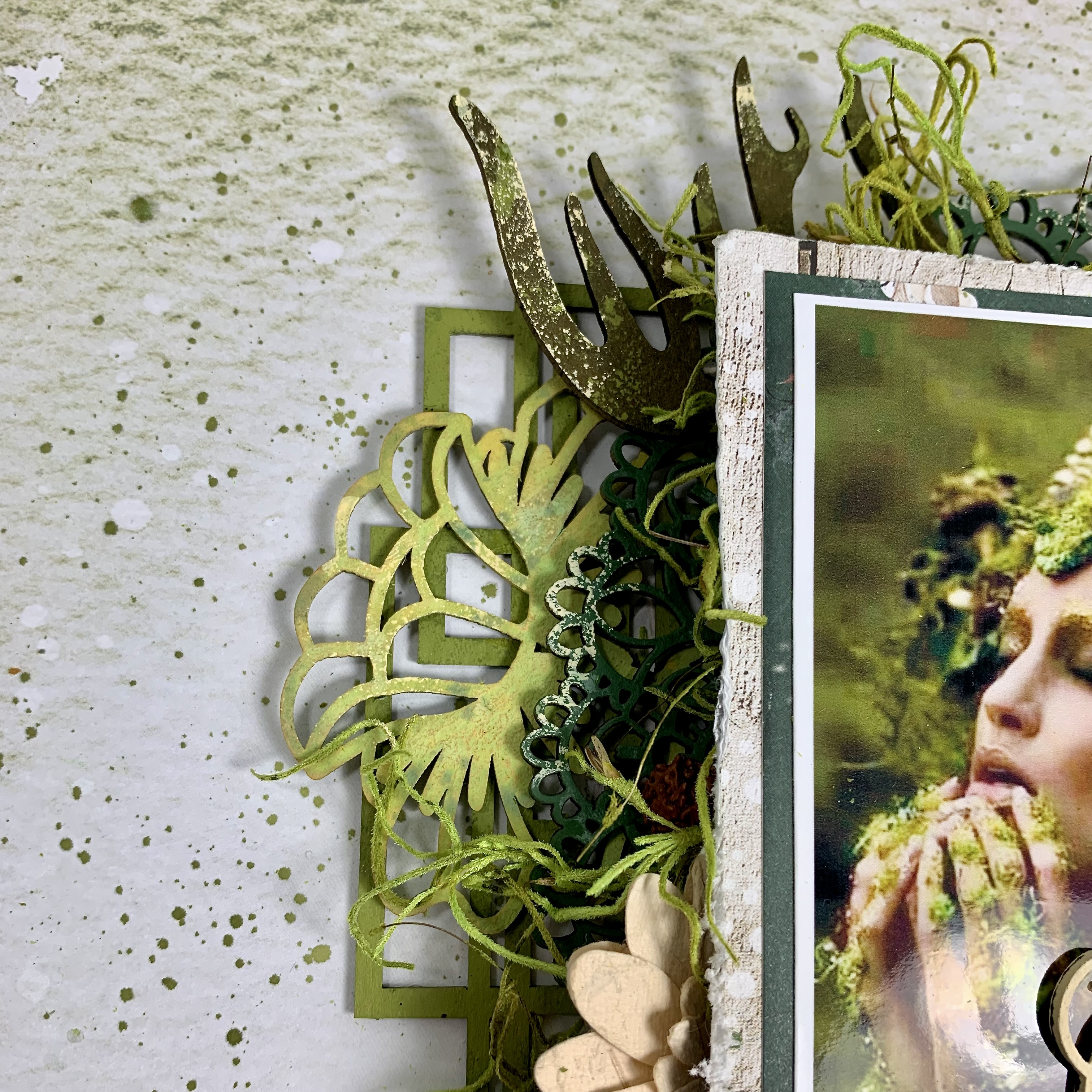
The first chippy that I reached for was the beautiful Doily Frame that has been around since about 2014. I even decided to cut my stock photo into a round shape so that I could capitalize on the circular configuration. I painted the Frame with Tim Holtz Wild Honey Paint.


I knew I wanted to also include the Leafy Cluster pieces (shown further down the post) which were painted with Peeled Paint and then topped with Shimmerz Vibez Palm Reader mist which gives a nice, golden shine. The above photo gives us a view of the wood veneer Bumblebees (which I love) as well as some grassy pieces which is exactly what they are! As I was searching through my Summer file folder looking for the bees, I stumbled on the Grass Set and thought they were perfect for a little texture!


Plan A was to add a mossy green grass from the craft store but I like how wispy the grass pieces are and this project demonstrates how to think outside the box when using your chipboard stash. Look at the shapes and use then more as layering pieces or however you choose rather than just as stand-alone pieces.


Now we are on the right side of the photo and can get a better look st the 49 and Market florals and those lovely Leafy Clusters. These are fairly new to the CE store and I am really loving them!


For my title I've gone with a die cut from the Countryside paper range. It says "Where the Green Grass Grows."  I had fun layering in my florals and miscellaneous pieces.


I added another Grass Set piece on the upper side of the Doily frame to fill in a blank space there. The Leaves and Grass were all altered as mentioned above.


And here is a more straight on shot of the 2 pieces of Leafy Clusters that I used. There are 3 in a pack, I believe. And don't you just love the sweet Die Cut bee? I popped a few of these up on foam squares.

So summery, so fun! I hope you like my composition!

Thanks for coming by the blog today!

Here is a link to the Creative Embellishments Store: CE Store

See you next time!

Sandi


Friday, April 7, 2023

Terra Cotta with Sandi Clarkson ~ Creative Embellishments

Hello, Creative Embellishments fan!

Sandi here with you today sharing my first project for April, 2023.

I've gone with another monochromatic theme (probably my last for awhile). Although my original plan was to go with coral, my colors actually lean more toward terra cotta or a reddish coral.


Let's start with the CE product list for your convenience.

Creative Embellishments Products: 

Scribbles 

Lace Border 6 

Fancy Filigree Flourish 

 Infinite Circle Frame

Doily Border 

Small Circles Stencil

After finding a paper that would suit my coral scheme, I began choosing some chipboard pieces to use and this time chose a doily border, a frame, a lace border and a couple of favorite flourish type items.

My pieces were then altered using Tim Holtz Saltwater Taffy and Abandoned Coral using mostly paints but added in are some stains and oxide products as desired.  As I mentioned earlier I had planned more of a saltwater taffy look but needed more contrast against my paper.

My photo was chosen last, only because my original photo was color and quite busy. I had really wanted to use that first photo but sadly it will have to wait. Photo credit: AP.

Paper are from 13 Arts Magnolia Dreams and flowers are all 49 and Market. I did some stencil work and mixed media on my background papers


This was one of those projects that really wore me down. I struggled through all of it! However, late in the game, I realized it was the original photo I was fighting against. Also, my artistic self realized that this is not perhaps the greatest stand-alone color. But it looks amazing when used with denim blue! So, keep that in mind as you create if your taste runs like mine.

See you next time!

Thanks for stopping by!

Sandi


Friday, March 24, 2023

Bee Kind ~ Altered Tag for Creative Embellishments!

Happy Friday, scrappy fans!

 Sandi Clarkson  here with you today sharing my latest project for Creative Embellishments. It's been a few months since I created anything on one of the Large Tags from the CE store. They are one of my favorite substrates as they are 5.5 inches by 10 inches which provides plenty of room for creating!


Before we get into all the process details, here is a list of the CE products used for your reference:

Creative Embellishments products used:

Large Tags 

Chicken Wire Panel 

Birdhouses 

Flourish Dragonflies. 


I began by selecting my papers from 49 and Market's Countryside collection. Since Spring arrived here in Texas, I was really drawn to the green, yellow and black color combination. I sanded some of the edges here and there for a weathered look. 


I used a great photo to compliment the papers and got busy selecting  the additional chipboard pieces. I first thought of using everything in its raw, unaltered state but then opted for a light wash of walnut stain over everything except the tag itself.


I've really gotten back in to using the 6x6 panels and went with the Chicken Wire Panel for this piece. I cut it apart and used it to enhance the other elements and to serve as a base layer.

I used a ton of yellow Prima flowers to support everything including this sweet tag with the bee! 


I also tucked in some Olive green florals from 49 and Market as well as some cheesecloth. 


For whimsy, I added the sweet Flourish Dragonfly from the set of 3. Then I layered a subtitle piece over it. So cute! 


Additionally, I made use of the little pieces inside the hexagon chicken wire and added then randomly.


There are so many sweet pieces that go along with this collection, so I've added a second bee to layer over a die cut floral.


Lastly, I splattered Prima's Color Bloom in Gold Foil to blend everything and make my project glisten a little. For once, I opted not to use any further art stones or texture other than cheesecloth which was tucked here and there as well as some crinkle ribbon. 


That's it for me today!

I hope you like this one as much as I do.

See you next time,

Sandi


Friday, March 17, 2023

Together Forever layout for Creative Embellishments

Hello, CE fans!

Sandi Clarkson here with you today sharing a lovely shabby chic layout using a few chippies and some pretty patterned paper from Prima Marketing.


I've had this photo printed out for quite some time waiting for just the right time, right papers etc. Do you pile up photos waiting for the perfect whatever? I sure do.

Anyway, these Love Notes papers from Prima Marketing called for something really special. I adore this photo of some of my grands during a family photo shoot several years ago. This was right before they left for the mission field in Ecuador. That cute baby girl just turned 7 years ago! How can that be?


I thought that with the light colored papers and subdued flowers that some dark chipboard would help ground the project. So, I altered my chipboard pieces with Walnut Stain. However, the wood veneer Heart Clusters were left bare. I love the beauty of the wood veneer all by itself.


Along both sides of my photo. I placed my altered Heart Pieces. On the left I've used the outlined ones and on the right, I used the solid. Much of them got covered up by flowers et cetera but my philosophy is that chipboard (or any embellishment, really) is made for using! The layering of them is what provides texture and interest. It's similar to NOT being afraid to cut into your favorite patterned paper. Use it, folks! Use it!


Here we have one of the wood veneer Heart Clusters I mentioned in the beginning. I also used some little heart pieces from that package near my title and also on the right of my photo.


Here is that cluster on the right. So fun, so layered! I've added in some pearls and other die cut ephemera as well as a die cut doily.


My title piece is from the  Together Forever set which include 2 sets of different sizes. The little teeny tiny wood veneer heart looks so cute added in there!


And this last photo just shows some of my layering of papers, floral, chipboard and other elements.

Once I had the basic design figured out, this layout went together really quickly. Figuring out the layering of multiple patterns can take some concentration and often some fussy cutting, huh?

That's it from me today.

Thanks so much for stopping by!

There are all kinds of Love and Heart-themed chippies in the Creative Embellishments Store. I encourage you to stop by if you are in the market for scrappy supplies!

See you  next time!

Sandi  


Friday, March 3, 2023

Bold and Beautiful for Creative Embellishments

Hello, Creative Embellishments fans!
Sandi Clarkson here with you today sharing another pretty layout that can hopefully inspire you to create something of your own.

This time I tried doing another monochromatic look and choose mainly Plum/Wine/Purple tones. I also mimicked last week's method of choosing a panel chipboard piece, a frame (or two) and then chipboard accents to tuck in here and there.


My photo is from Tumblr or Unsplash and works perfectly with my primary chipboard frame. The silver tones work well with the darker hues surrounding it.


 For my base layer I chose the Heart Panel 2 which was altered with 13 Arts Violet Ink which is a very dark saturated color.  I opted to use 2 frames this time and the one beneath my photo is the Out of this World Frame. You can barely see it here but I mention that because it was the order of my process. I altered that frame with Distress Oxide Spray in Picked Raspberry.

After readying my photo with a photo mat and mounting squares, I painted the Feather and Beads Frame  using Distress Paint in Seedless Preserves. I also had fun altering the look by applying droplets of the previous Oxide color and swishing with water to achieve the oxidized look.


I had 5 feather pieces from the Feathers set that I layered into my focal point. Three of them were altered with Distress Spray Stain in Kitsch Flamingo without any prep to the chipboard. They looks more pink IRL but I had fun just experimenting and skipped the gesso prep. The other 2 feathers were altered with 13 Arts Woodbine Chalk mist and you can visualize one of those here. Although not quite in my color palette, they do blend with the beautiful 49 and Market Plum Grove papers that I used.


Here you can see the Out of this World Frame just a bit better, as well as the Heart Panel 2. Since my panel was already irregular, I saw no need to cut it apart.


I love how the Feathers soften the look of the focal area and wanted them to really stand out. Thusly, I omitted adding any fibers such as moss or sisal.  I did have some merlot florals from 49 and Market which I've used here but the larger floral was just the best I could find last night without going to greater lengths. I think it works fine given my floral layering papers with the florals at the top.


To balance my layout, I added a cluster to the lower right hand area of the layout and added a title piece. Lots of foam to pop up the layers.


I added in a bit of ephemera from the Plum Grove collection as well as a few neutral parchment florals also from 49 and Marlet.


Here is a side view to show the page dimension which is actually flatter than my norm. Ha! Additionally, I added my butterflies after taking this photo. Taking photos of your work can very often help you see what is missing from your project that you might overlook in the moment of creating.


I finished with some splattered white paint and a few purple/plum flat backed pearls.
Thanks so kindly for dropping by the blog today! Let me know if you are inspired to use a monochrome theme!
 
See you next time!
Sandi


Friday, February 24, 2023

After the Storm with Sandi Clarkson

 Hello, scrappy friends!

Thanks for coming by the blog today.

I know it's maybe a little early but I have something GREEN for you today. This is my little nod to St. Patrick's Day but without the shamrocks.


I remember doing a monochromatic layout about 10+ years ago in varying shades of green. Although I didn't expect to like it, I was unexpectedly pleased with the outcome. So, I thought perhaps I could do something similar in honor of Saint Patrick's Day this year. Well, the odds were in my favor, I think!


So, then I began the process of finding just the right photo and the right papers and the right chipboard. You know the drill, I'm sure. Once I found my photo, everything felt right. After looking through my papers, I opted for this stunning paper from 13 Arts Dreamland collection which blended perfectly with the mood of the photo. At least from my standpoint. Life for me right now is a swirl of emotions and difficult days. But I trust that something beautiful will come along in the days ahead.


But back to my project .... next I started choosing my chipboard pieces and was thinking along the line of flowers and flourishes, maybe a frame. However, I came up with some interesting choices that I felt were just perfect in the end. I knew that the green color palette would blend everything together but the pieces actually told a little story as I went along.


I wanted to use one of the 6x6 panels to ground my photo. I have plenty of options in my stash, that's for sure. However, the shape of the Rectangle Panel seems to be a fantastic juxtaposition for the photo and really grounded the focal area. Love that choice for this project! It was altered with Distress Paint in "Peeled Paint" and later dabbed with the same color way but in the ink format.


Rather than using a frame for my photo, I wanted something circular behind the photo and opted for the Doily 2 which was altered with Distress Paint in Rustic Wilderness and then splattered with the same in the Oxide version. Later it was dabbed slightly with a cheap cream craft paint from the big box store. This cream paint blended all my pieces together much like you could do with white gesso.
 
I had fairly recently acquired the sweet Daffodils 2 which were in my Flourishes and Flowers folder. I thought they would be perfect to represent beauty springing up from the ground. Or hopefully, what will spring forth in my own heart and soul as I travel this bumpy road. These were altered multiple time with Distress Oxide in Mustard Seed, Twisted Citron and Wild Honey. They were later splattered with Distress Peeled Paint Stain and inked along the edges. This was a "you get what you get and you don't throw a fit" moment. It actually turned out great and brought out similar colors from the photo.  And I love using my stash!


This photo shows some details along the bottom of the focal area and you can see where I've added my title piece from the Blizzard Word Set. This was painted with the cream paint mentioned above and does bring out a few details from the photo.
I had planned from the get-go to call this piece After the Rain or After the Storm, so this accidental finding of this word amongst the Blizzard Word Set was bizarre! Just another reminder to look for the good in all situations, whether life or crafting.


Of course, I wanted to throw in some alters because there are some in the photo but I was down to just a few in my stash but went with what I had on hand! There are 2 different kinds of pieces both called Antlers in the Store, so you will need to pick these: Antlers.  Either would work and are quite nice but I do love randomly tucking them into my projects! These were altered with Peeled Paint Stain and splattered with Citron Oxide and then dabbed with cream paint at the end. Love, love how they turned out!


I wasn't sure if I'd add florals to my layout but I did settle on using a couple of parchment colored ones from 49 and Market. I also tucked in some lime moss here and there.  Great for added dimension.


Just a closer view of the upper edge of the focal area where you can visualize the Doily 2 and more Antlers.


And one last look at the completed page.
 
Spring is Coming, folks!
 New Life, new growth, maybe even a little Hope.
But first, it has to rain.
 
Thanks again for stopping by and hope to see you next time!
 
Sandi
 

Friday, February 10, 2023

Loving Lucy with Sandi Clarkson

Hello, Creative Embellishments fans!

 Sandi  here with you today sharing a Lucy layout featuring a publicity photo from when she was quite young.


This is one of those projects that took me forever simply because I was trying to conquer too many variable. This paper, that photo, mindful of background images, on and on. When I finally committed to just focus on my chippies, everything fell together so easily! Sometimes you just have to START and trust the process!


My papers are from 49 and Market's Serenity collection plus an additional brown card stock as my base. All my embellishments are from the January LE Kit from My Creative Scrapbook. I've used 3 chippies and they were all altered with Walnut Stain.

After prepping my paper and doing a little stencil work, I determined where I'd place my focal image and laid out my horizontal pieces. From there I knew where I wanted to add my Loved rub-on. Rather than using this as a title, I made it more part of the background images. Then I adhered the horizontal pieces and tucked my Lace Border 7 under the other 2 items.

Of course placing my florals and embellishments were among the last things I did before my paint splatters and adding some final pearls.

Below the Lace Border I added my title from the Gorgeous Small Border Set which again was altered with Walnut Stain.

One of my most favorite frames from Creative Embellishments is the Flourish Circle Frame. After altering it with Walnut Stain, I added some random, scattered  heat embossing using my chunky Stampendous Aged Gold embossing powder.

Here are two more images of the focal area:

Once I finished with my pearls and paint splatters, I finally felt finished! 

This was a fun one to do.

Thanks for coming by the blog today!

See you next time ...

Sandi