Wednesday, September 24, 2014

Creative Embellishments and Heartfelt Creations Cross Promotion


Hello, everyone!

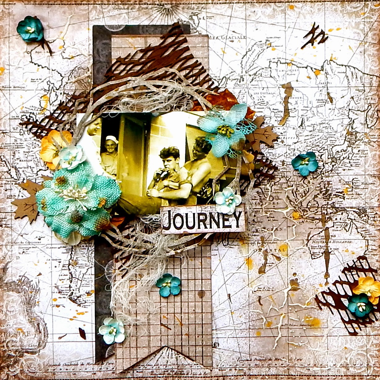
It was so fun getting to work with product from two great companies this time! I created a layout of my Dad (far right) using paper from the Heartfelt Creations Celebrate the Journey paper collection. All so warm and neutral. Since this photo was from Dad's Navy days, I selected the 6x6 Fishnet Panel from Creative Embellishments and stained it with Ranger's Vintage Photo. It's been cut apart and strewn about the page but primarily used as a layer under the photo.  I've framed my photo with the Twig Frame with Fall Leaves from Creative Embellishments. It's been gesso-ed and then misted with Prima's Antique Gold Color Bloom.  The Fall Leaves portion have been left bare.  I know …  I'm getting brave! 


I love old photos and the seeing that my parents even at their silliest. You can see my Dad's one and only tattoo on his left wrist. His Navy friends were all supposed to get one as friendship bands. He went first  .. and last! He always wore his watch on the left, so most photos hide it. I thought this was a good opportunity to document the obvious. 


 A little molding paste, splattering, Petaloo and we're all done with our creation. 

This is my last Design Team project for Creative Embellishments for this term and I want to thank Nicolle for having had me. It's been great! 

Thanks for coming by! 
Monday, September 22, 2014

September My Creative Scrapbook tutorial

As seen last Friday on the My Creative Scrapbook Blog … 

Hello, My Creative Scrapbook fans!
 Sandi here with you today to share a Build a Page on one of my pages this month using the Limited Edition Kit. 


This was one of my favorite layouts although Primary colors are not my usual palette nor were they truly intended for this collection, I don't think.  Just goes to show you how versatile things can actually be! 


As I went through my Limited Edition Kit contents I was struck by this quote about Family and knew instantly that I had to use it as a page element .. as a whole. It speaks volumes, doesn't it?  Apparently I was not alone in thinking that as most of the designers used it. 


I was also really, really wanting to scrap this sweet photo of my twin grandsons, Bobby and Danny with their sweet blue umbrella and bright blue shirts that matched. The photo was taken by an older sibling, so not the best quality but I adore it! I tried converting my photo to b/w, sepia or even antique or other filters and it just wasn't quite the same. I really like the bright blue which is so unlike me. So, I had to cover that teal ribbon at the top of the page, color it, ignore it or something. Lots of people mix and match their blues but that's hard for me. 


So, problem solved! 

A little punch work and that makes it even better! I also re-printed my photos and made them smaller and printed 2 of them. Small is trendy, 2 is trendy. That works perfectly with Danny and Bobby being twins! 


After getting some idea where I wanted to place my photos and embellies, I did some stenciling with molding paster to the right lower corner. Prior to that I had primed with Clear Gesso. 


A little misting applied with a moist baby wipe and Prima's Bloom Spray in Cobalt.  I use baby wipes for both adding and subtracting color. 


Next, I added more depth and dimension with some of my favorite stamps. 


Then I started layering strips of paper and the back side of a note card (red polka dot) as well as the first flower and photo. I've used foam tape behind my photos for the sake of time .. goes a little faster.  I think I used 4 layers of tape on photo #1 and about about 8 layers on photo #2.  Crazy but fun! 


Onto another layer of flowers and photo #2 as well as some secondary embellishments. This kit is full of parts and pieces to add here and there.  


In the completed page, you can see that I've added some underlining beneath the word "family" and "wonderful" in the fabulous quote to really make the heart of the sentiment stand out. I tucked some Spanish Moss from my craft stash in under my flowers to coordinate with the bird theme from the bottom left. I little tweaking, gesso-ing and it was done!

 Something  a little different from me but I really like the outcome! And enjoyed finding a way around the color dilemma! 


Tuesday, September 9, 2014

My Creative Scrapbook September Reveal, part 2


I'm back today to share project #4 with the My Creative Scrapbook September Limited Edition Kit. I'll be doing a tutorial on how this page was put together later this month on the MCS blog. But I'll share a couple of close-ups for now. These are my adorable twin grandsons playing with their bright blue umbrella. I just had to keep the bright blue even though that's not my usual palette. 


You can find details on ordering kits HERE
   Thanks for coming by! 


Friday, September 5, 2014

My Creative Scrapbook Reveal Day!

If you are here for the Creative Embellishments Blog Hop, please click HERE.

Happy Reveal Day, everyone! Thanks for coming by! 

Pam has put together another beautiful Limited Edition Kit at My Creative Scrapbook featuring a combination of Authentique's Harmony Collection along with Carta Bella's Moments and Memories. (Love mixing paper lines!) Of course, there are lots of yummy Prima flowers as always, gorgeous trims and one of the fab new Prima stencils! Yay! 


I'm not sure that I even have a favorite layout this month (each one has it's own appeal) but we'll start with this one. My youngest daughter, hubby and friends recently went on a trip down the West Coast and this photo was taken at Carmel Beach. I converted it to "antique" for a perfect pairing with the colors on this page. I loved the quote on the notecard in the upper left corner and it was just right for a soothing photo of ocean and sand. This artist is enjoying it vicariously. =) 

The beaded trim is so pretty that I could have used it on everything but chose to use a long strip of it here to mimic water droplets.  The stencil was simply used at random with molding paste and my mists were applied with a moist baby wipe. I use them for both applying and removing color. 


***


Wow, I cannot even remember the last time that I used black as a background color. It is so not me but I thought I'd switch things up a bit. I actually wish that I had done less splattering on the b/g so that more black would shown but oh well … not sure why the teal looks blue in the center but it is teal. 

You can really see the stencil at work here. There are actually 2 designs on the stencil itself and this is one of them. I tried to use them in a variety of ways to give you more ideas about how you can use them. 

These papers are quite heavy weight, so if you plan to do any punch work, I'd suggest you use a deep edged punch or one without intricate detail to avoid a jammed punch. It didn't happen but I have had it happen in the past, so I went directly to the heavier punches when I used them. 


***


This third layout is a more clean and simple style for me but sometimes that is exactly what I want. I love mixed media but I occasionally want a more classic look, especially on a wedding page. A little molding past to carry out the "cheering flowers" pose.  

I adored the floral paper in the center and used some as a fussy cutting opportunity and then used the remainder as the panel. I especially loved the flowers in the upper right. But the ones on the upper left and lower right were fussy cut. I misted one of my brown Prima flowers to make it purple, added in some of the beaded trim along with some gold metallic thread, ribbon and stickers and made myself a great cluster! 


Here is a photo of the Limited Edition Kit: 


I'll be back in a few days with my 4th page. It is a totally different palette so I decided to post it separately 

For information about our kits, visit HERE. And to see what the DT did this time, go visit our GALLERY. You're sure to be inspired. 

Thanks for coming by! 

Tuesday, September 2, 2014

My Creative Scrapbook September Sneak Peeks!

If you are here for the Creative Embellsihments Blog Hop, please click HERE.

It's that time again! Sneak peeks are up over at My Creative Scrapbook for the September Kits!

 Here are some sneaks from the ever-gorgeous Limited Edition Kit. I had so much fun with this one! 


Reveal Day is September 5th. Hope to see you then! 


Monday, September 1, 2014

Creative Embellishments 1st Anniversary Blog Hop


Welcome to  Creative Embellishment’s 1st Anniversary Blog Hop. 
You should have arrived here from Michelle's Blog. If not, then please go back to the Creative Embellishments Blog to start at the beginning! Be sure to read all about the great anniversary and Blog Hop prizes and more importantly the NEW challenge rules! You must start incorporating at least one Creative Embellishments product in your challenge entry … which seems entirely fair to me! 

Now, are you ready to see what I created? 


Today I'm sharing an altered journal/calender. The pictures just don't do it justice! And I've taken multiple sets! 

 Back in May the hubby and I were on a little trip when I found this great little tag with an image by local artist Thereasa Ramsey of Weatherford, Texas.  I thought this sweet face was a little bit Boho, a little Steampunk and a whole lot ME!  Back in my younger days, I "owned" Boho! Heck, I probably thought I invented it! Heehee! These days I have to tone it down a bit, though! =) And …of course, all things "Steampunk" just kind of bring out that inner artist in me. So, I bring you Boho/Steampunk/Chic. 

I've had this BoBunny Misc Me! Kraft Journal/ Calendar (along with the Vintage inserts) that I've been using since last year to keep track of when my Design Team assignments are due and to write down what products were used on each project! REALLY helps me stay on track! Until now it has been unaltered … but that's all changed now!

 I started by stamping the front cover with the Distressed Brick Stamp in Ranger's Vintage Photo in a very random fashion. To add a little drama I've heat embossed here and there with Stampendous Fran-tage Aged Gold Embossing Enamel. 


Next, I got busy altering my Steampunk Gear Panel (my favorite CE product has to be any of the panels!) with that same Vintage Photo and some heat set Stampendous Fran-tage Aged Gold Embossing Enamel along with a couple of Prima Bloom Sprays .. Antique Gold and Pearl White as well as a couple of Distress Paints .. Fired Brick and Wild Honey.  Here you can see a bit of my Fairy Wing Set 2 which I will tell you about here in just a bit.


My tag says "Imperfection is Beautiful." So, I decided to finally, once for all, embrace that and leave a chippy naked! Yep, first time ever! Well, I did add a dab of gesso which is used on everything for blending. Does it still count? I hope so because that was really, really hard for me! So, there is my NAKED Flourish Dragonfly tucked under that flower. I also have a Flourish Set 17 underneath my floral cluster which has been altered basically like the Steampunk Gear Panel minus the Bloom sprays. See the neat little metal leaf over to the left? Gift from sweet DT sista, Doris! Thank you, Doris!


Here you can see the Distressed Brick Stamp, more of the Steampunk Gear Panel and part of the Fairy Wing Set 2. I love the few dots of embossing powder on the cover and on the tag .. yum! Well, I love it all! This is so me! Including the pumpkin spice crinkle seam binding.  It's fun doing projects for yourself occasionally. 


Now about my Fairy Wing Set 2! Experiment gone slightly awry! But hey, I try to keep it real! I used a rock salt technique of scrappy friend Tracey Sabella. It's been done by others as well including her inspiration Michelle Grant. Here is Tracey's version: Rock Salt Tutorial.  I did each of those steps except for the wire brushing. I think my error was in using too much Mod Podge which then filled in my crackle. So, to compensate I later went back with another very thin coat of Crackle accent which helped a bit. Then as I was gesso-ing everything, I added some gesso to my Wings and waa-laa, my crackle re-appeared! Things are still a bit too thick and goopy but live and learn, I say! So, the steps are:

Gesso your chippy, let dry
Add mist of any color
While still wet apply chunky salt like rock salt or sea salt
Spray again with your mist
Allow mist to thoroughly dry 
Brush off the salt completely
Use wire brush to scratch shipboard as desired esp on larger solid pieces
Apply Crackle Accents and allow to dry several hours; do NOT use heat gun!
Apply Glossy Mod Podge .. if you dare! (I won't ever do that again!) 

Then in my case I re-applied my Crackle accent; dried several hours
Applied gesso to highlight the cracks

This effect looks really great on large, solid chipboard pieces such as a door. Not really meant for delicate pieces but hey, I was having fun! 

Thanks for coming by today! I hope you enjoyed my fun little project!
 Be sure and visit the STORE and get stocked up! 


Did you notice that I didn't use the Distressed Crackle stamp, LOL? That is my favorite CE stamp but I figured you were tired of seeing it! And of course, I love all the frames. And all the flourishes! All the stamps! Are you getting the general idea? =) How do I pick a fave? 

The next stop along the way is Tammy's Blog.  

Thanks for coming by and have fun hopping! The Hop ends Sept 7th at 11:59 EST.