Thursday, April 28, 2016

The Full Tranquility Collection ~ Blue Fern Studios

We are excited to reveal our brand new paper collection created by the super talented Manu.   Tranquility means "a state of peace and quiet" and you will feel that with each sheet of paper in this collection.  The colors are soft with varying neutral shades of gray and brown.  You will find beautiful textures mixed with weathered distressing.

Here is a close-up look at each of the 10 double-sided papers in the Tranquility collection.  
Be sure to scroll to the end because we also have some beautiful flowers, chipboard, 
and embossing powder that will coordinate beautifully!   


Did you notice the awesome names of each sheet of paper?  They are all words that evoke the feeling 
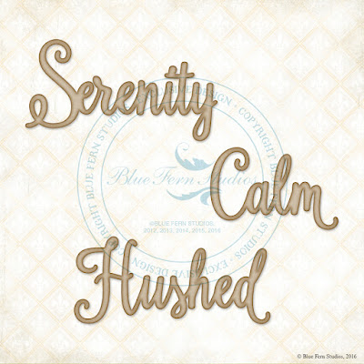
of being tranquil.  We loved these words so much, that we have created chipboard titles using them.  
Hopefully you are already thinking of how you would use these words on your next project!


In addition to these beautiful titles, we also have the Jubilation Corners and Tranquility Foliage.  


Did you know that Blue Fern Studios is now carrying flowers?  We have put together two sets that will blend beautifully with the Tranquility collection - Tranquil Lilies & Roses, and Tranquil Blooms.


To add some pizazz to your chipboard and stamping, we are introducing four new colors
 of embossing powder with this collection - 2 stunning colors that will add some pop, 
and 2 gorgeous neutrals.  


 We are super excited about this collection and can't wait
 to see your projects using it.  

Love, love, love! 


Tuesday, April 26, 2016

Tranquility Introduction ~ Blue Fern Studios


Yesterday on the Blue Fern Studios Blog on Creative Team Co-ordinator, Valerie Serfozo posted 
several works by the Creative Team featuring the brand new Tranquility collection designed by Manuela Zimmerman. 

It is a beautiful, peaceful collection that we believe will appeal to many of you. Here is my first creation. Details coming on May 12th … but I have posted my supply list for you! 

Paper: Tranquility Hushed and Calling Cards
Chipboard: Organic Coins, Blissful, Jubilation, Patience set, Scalloped Border
Stamp: Making Plans
Embossing Powder: In The Navy, Nutmeg, Garnet
Glitter: Fool's Gold
Flowers: Tranquil Blooms, Tranquil Roses and Lilies

See you soon! 
Sandi


Monday, April 18, 2016

The Perfect Moment ~ Blue Fern Studios

Hello, everyone!
I'm back with you today sharing another of my April Blue Fern Studios Products!
Since I felt that I hadn't really got to dig into my Timless papers, that's where I went.


I prepared my background with gel medium and black gesso pushed through a stencil. Then I  used some gold mist to bring out the yellow tones in the paper. I finished with the Postal Texures stamp to remind myself of my Grandma's faithful correspondence.

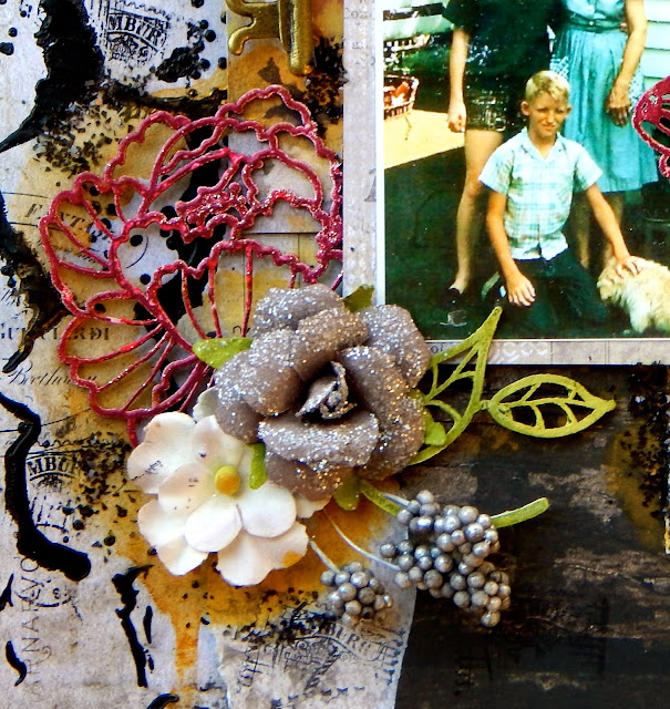
The photo of my brother and me with our Grandma Key was taken on her small farm in Indiana. She was such a special lady, always had a kind word, worked hard, raised 10 kids and loved her flower garden. She was so faithful to write me and there was always a mention of how her flowers were doing .. or that she couldn't wait for Winter to be over so that she could get outside. So, I had to pull out my fave BFS chipboard, Ginger's Poppies and put them on her layout!


I prepared the Poppies, as well as the Paisley and Vine Flowers with white gesso, the used gelato for color and went back with my embossing powder in Garnet.  Before I went to heat the powder, I sprinkled in some Pyrite Glitter, just to give the flowers a hint of shine like dewdrops.


Just a close-up. 


 Additionally on the Paisley and Vine leaves, I did some stamping with Postal Texture stamps, always a nice touch!


Lastly I added some dimensional flowers and berries and a random key laying on my desk. Nothing is complete these days without some added glitter or microbeads, so I've added some black chunky glitter.


Just a couple of dimensional shots!


Blue Fern Studios Products used:
Paper: Timeless Artistique. Abode and Calling Cards
Chipboard: Ginger's Poppies, Paisley ands Vine Flowers
Stamps: Postal Textures
Embossing Powder: Garnet


Glitter: Pyrite

Thanks for coming by today!
I appreciate those people who still visit my lonely blog!


Saturday, April 16, 2016

A Blue Fern Studios Canvas ~ love them!


"And so …"

Back with another Blue Fern Studios DT project!
There is nothing I enjoy more than creating a canvas project! It feels so liberating to know that if I mess it up, I can just cover it with gesso and try again. And sometimes, you just get stuck in a rut when you do layouts consistently. So, the other day, I let loose and allowed the inner artist to have some expression.

I started with an 8x8 canvas and decided that I wanted to use this inspirational quote from the Serendipity Calling Cards sheet as my focal point.  I also tore some scraps from the Merriment sheet to place in the center and in the corners.

Before adding my papers, I prepared the background with gesso and then had fun with my Imagine Ink mists, Fern, Cotton Candy and Winter Mint drying between colors.  More dimension was created with some stamping utilizing the Brocade Texture, Textures 1 and Photography stamps.  Of course, I did some stenciling and created texture with super heavy gesso. 


The Twilight Garden Frame frames my primary focal point. I first painted it black and then used  Oatmeal, Peacock and 14K Embossing Powders to give it character! I love how rustic it looks! 


Then I added some embellishments that were laying on my desk, some flowers, a junkyard light bulb, ribbon and a couple of stick pins. I fussy cut some of the Merriment butterflies and worked them in as well. 


Of course, I had to use one of my new Courtship Blooms because I adore their size and shape. 
My finishing touch was to apply some mircro-beads with clear gel medium. 

Blue Fern Studios Products used:
Paper: Serendipity Merriment and Calling Cards
Chipboard: Twilight Garden Frame
Stamps: Brocade Texture, Textures 1, Photography
Imagine Ink Mists: Cotton Candy, Fern, Winter Mint
Embossing Powder: Oatmeal, Peacock, 14K       
Flowers: Courtship Lane Blooms

I'll be back in a few days with project #3 for BFS!
And  …  I'm hard at work on next month!


Tuesday, April 12, 2016

Brown Eyed Girl ~ Blue Fern Studios with Sandi ~

Hello, Blue Fern Studios fans! 
I'm back today with my first April  project for Blue Fern Studios. 

 "Brown Eyed Girl"

Now I have  gone back and created with Serendipity again! 
It's mix of rich earth tones and grunge widen  it's appeal to more paper crafters.
The background paper is Chronicle and then I've added torn Glee, Contemplation and Calling Cards.


Hiding on the left is a Butterfly Grid remnant from last month. But the main focus here is the Berry Stem embossed with Verdant And Grassy Knoll. You can see a bit of the Brocade Texture stamp which I adore! 


Brown-Eyed Girl was simply inked with brown and then given a dose of random glitter. 


I had fun with the Techno-scape chippy using Ginger Embossing Powder and Mermaid Glitter! I cut it in half so that it could peek out under my layers. 


Great close-up of the Brocade stamping. 

Blue Fern Studios Products used:
Paper:
Serendipity Glee, Chronicle, Contemplation, Calling Cards
Chipboard:
Butterfly grid remnant, Brown Eyed Girl, Techno-scape, Berry Stem
Stamp:
Brocade Texture
Embossing Powder:
Ginger, Verdant, Grassy Knoll
Glitter:
Mermaid

That's it from me today.
I'll be back in a few days with more of my April projects. 

Remember,  I'll be back on the 17th of every month at BFS with a Social Media Update.
Be sure and hashtag BFS on Instagram because I'm looking for folks to feature!
https://www.instagram.com/bluefernstudios/

See you then!

Saturday, April 9, 2016

April Prima Product Pick


Hey, there, everyone! Finally getting a chance to create for myself!

I had a few papers, this sweet baby photo below and some flowers set aside to play along with last month's PPP but got sidelined with the sickies, so ... I decided that this month I'd get at it early in the game!
Of course, Prima threw a serious twist in there with the color scheme but hey, I'm a big ole nerd where the Pantone Color of the Year is concerned. I love, love, love reading about the whole psychology of that, how they study and decide, the trickle down, the economics .. like I said, a serious nerd. So, I dug deep, really deep into my Prima stash and grabbed some old and some new, did some altering and here you have it!


Two sleeping babies. Is that not Serenity at it's finest? And their sweet momma is the Rose Quartz in my opinion. Just sayin'. As some of you know, I am blessed with a very large family and now I have 2 more sweet little grandsons. Life is good. 

I wanted to carry through with the photographer's nestling idea, so I just tried to cluster some layers around my photo as is common anyway and then balance with a few other mini clusters. (Photo credit to Simplicity Photography.) 

My dotted navy comes from the really vintage Moulin Rouge, yes really. And the large flowers are from the Gatsy collection. I altered them with some Color Bloom Spray to freshen them up. I sacrificed a much loved Lyric bloom and then used some more current Tales of You & Me and Salvage District Blooms.

My background was created with the stencil and stamps as listed below. Everything is Prima except for some misc twine, versamark, gesso and cheesecloth.

Here are some close-ups:


Love my Parisian Lace Die.


My alphas are probably a tad dark. I meant to lighten them up. But they are my title after all. 


Thanks for coming by! 
This was actually SO much fun to create!!! 
Sometimes going outside your comfort zone is the most liberating thing you can do! 


Supply list
Paper:
Princess Collection Princess Collage 12x12
Something Blue Collection Goin' to the Chapel 12x12
Moulin Rouge Collection Blanche 12x12
Almanac Collection Shaffer 12x12

Flowers:
The Gatsy Collection #546403
Tales of You & Me #586317
Lyric #564452
Salvage District #586416
Tales of You & Me # 586317

Stencil:
#575922 6x6

Stamps:
Clear Stamp # #960780
Cling Stamp #570491

Trim:
Plumeria #583002

Color Bloom Spray:
Cobalt
Cotton Candy

Chipboard:
Tales of You & Me #990916
Cartographer #990169

Die:
Parisian Lace #584047

Junkyard Findings:
Water Taps #891824
Street Signs #92173

Alphas:
Tea Thyme #559021


More My Creative Scrapbook ~ Prima Vintage Emporium


Next, I decided to step away from the pink palette and go neutral. This paper from Prima's Vintage Emporium was perfect for my needs. 

In case you hadn't heard … 
This month's Limited Edition Kit at My Creative Scrapbook is truly jam packed! 
The featured papers are Julie Nutting's Belle Vie produced by PhotoPlay and Prima's Vintage Emporium.  As well as the Belle Vie papers we get the Alpha sticker sheet, Element Sticker Sheet and   the matching chipboard set.  We have 3 pkgs of gorgeous Prima flowers, misc rosebuds, lace, pearl and burlap trims,Vintage Emporium brads and Frank Garcia's Memory Hardware locket pieces. Also … a Chipboard flourish, a TCW Stencil and lastly a paper doily.  Yes, all that in one Kit! 

***
I've used the Stencil from the Kit to help me create my background. Then I took the burlap trim from the Kit and created a triple layered heart instead of using it as ribbon. I also cut some small leaves from it and tucked them here and there. I've used the cream flowers from the kit along with some embellishments and trim. Lastly, I had fun with the chipboard flourish! 


I've used gold Embossing Powder from Blue Fern Studios and then inked the flourish here and there. While the Embossing Powder was still warm, I dropped some gold microbeads here and there. 


Some stenciling and stamping plus a few more embellies. 


Close-up of the wee little heart. 

For lots and lots of incredible inspiration, have a look through our spectacular Design Team Gallery!
It is filled with tons of inspiring kit creations from our team!

My Creative Scrapbook is currently accepting new members!
Subscription information can be found here: http://mycreativescrapbook.com/join-the-club/

Follow us on Facebook!
http://www.facebook.com/pages/My-Creative-Scrapbook/130352440344752

My Creative Scrapbook is on Instagram!
http://instagram.com/mycreativescrapbookofficial

Sketch contest reminder:
The deadline for submitting your sketch contest layouts is the14th! Don't miss out on your chance to win the fabulous prize package.  The details can be found on our sketch blog at http://mycreativesketches.blogspot.com

That's all for today. 
One more layout from this kit coming up in a few days.
As always, thank you for coming by!